
Affordable Learning. Stronger Student Networks
Affordable Learning. Stronger Student Networks
Tutornomic reimagines tutoring as a collaborative student network where learners can find affordable academic help, connect with peers, and strengthen their understanding together. Instead of relying only on expensive one-on-one tutoring, the platform supports a more flexible learning economy built around accessibility, trust, and shared student progress
Tutornomic reimagines tutoring as a collaborative student network where learners can find affordable academic help, connect with peers, and strengthen their understanding together. Instead of relying only on expensive one-on-one tutoring, the platform supports a more flexible learning economy built around accessibility, trust, and shared student progress
Client
Client
Algonquin College
Algonquin College
Role
Role
Product Designer
Product Designer
React-native Devs
React-native Devs
Problem

Students find tutoring too expensive and
feel they don’t need a professor for basic tasks.
Students find tutoring too expensive and
feel they don’t need a professor for basic tasks.
GIF
3.1 Problems statement
Conducted through SurveyMonkey
> 67%
> 67%
> 67%
Students expressed that hiring a tutor is too costly for them.
Students expressed that hiring a tutor is too costly for them
Students expressed that hiring a tutor is too costly for them.
91%
~91%
91%
Students indicated that they would be willing to pay for tutoring services if possible.
Students indicated that they would be willing to pay for tutoring services if possible.
> 43%
> 43%
> 43%
Students reported that they find it difficult to network in college.
Students reported that they find it difficult to network in college.
Students reported that they find it difficult to network in college.
The research told me students weren't rejecting tutoring — they were rejecting its price and the isolation around it. Before touching a single screen, I turned those findings into a clear point of view, a set of principles to design against, and a prioritized feature set. This is the bridge between "here's the problem" and "here's the product."
From data to a point of view
Three survey findings pointed the same way: 67% found tutoring too expensive, yet 91% said they'd pay if it were affordable, and 43% struggled to build a network on campus. Read together, the takeaway wasn't "students won't pay" — it was that the traditional one-to-one model is priced and structured wrong for them. That reframed the whole project into a single question.
Image
3.2 Students discussing


Provide a student-centered tutor networking platform
The tutor networking platform reduces costs through peer tutoring and affordable pricing, allowing students to connect for support. It features discussion forums for sharing insights, study groups for collaborative sessions, and resource libraries for sharing notes, all of which enhance collaboration and strengthen the learning community.
Ideation

Image
Principles
Principles that guided the build
To keep the design honest to that question, I set three principles up front and measured every feature against them: affordability had to be structural rather than a discount, the experience had to earn trust at the moments money changed hands, and community had to be a core feature, not a nice-to-have.

Image
Synthesis
Turning needs into features
From there I mapped each student need directly to the capability that would answer it, which kept scope tied to what the data justified rather than everything we could build. Peer tutoring and low-commitment trial sessions attacked the cost barrier; transparent pricing and a clear payment flow addressed the willing-but-cautious signal; and a community layer of forums, study groups, and shared resources answered the networking gap. That mapping became the backbone of the screens that follow.

Image
Need to features map
Image
3.2 Students discussing
Provide a student-centered tutor networking platform
The tutor networking platform reduces costs through peer tutoring and affordable pricing, allowing students to connect for support. It features discussion forums for sharing insights, study groups for collaborative sessions, and resource libraries for sharing notes, all of which enhance collaboration and strengthen the learning community.
Solution
A peer network that makes help affordable — and social
An affordable, social alternative to one-to-one tutoring. Tutornomic is a peer-to-peer network where students get budget-friendly help from other students and build the campus connections they were missing. Three things hold it together: peer pricing plus trial sessions to lower the cost barrier, a transparent and confirmed payment flow to earn trust, and a built-in community of forums, study groups, and shared resources. Here's how that comes to life across the journey.
01
Problem & Solution





Design System


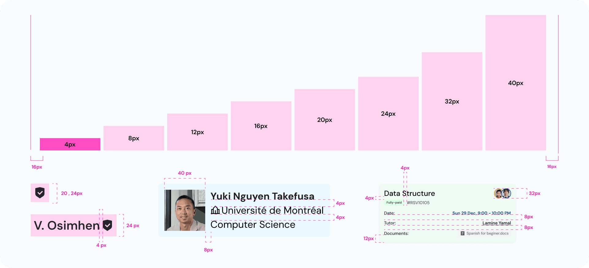
Wire frame
User interface
Listing screen
Design

Image
3.3 Listing screens
Enabling Efficient Discovery
My primary objective for this screen is to empower users to efficiently browse a diverse pool of tutors and quickly identify candidates that meet their specific needs. I aim to reduce friction in the tutor discovery process by presenting key information upfront, offering robust filtering options, and building immediate trust through clear indicators. Ultimately, I want users to feel confident and informed when selecting a tutor
Tutor detail & info
Design

Image
3.4 Tutor detail & info screens
Deepening User Engagement & Trust
This screen builds directly upon the tutor listing, serving as the dedicated space for users to dive deeper into a tutor's profile before making a booking decision. My objective here is to provide comprehensive information, reinforce trust, and facilitate an informed choice, transforming a casual browse into a confident selection
Book a session CTA
Design

Image
3.5 Book a session CTA
Optimizing the Call to Action
The initial design, featuring a straightforward "Buy Lesson" button, presented a significant user friction point. The refined design, moving towards a "Buy Trial Lesson" and offering session duration choices, directly addresses user apprehension and enhances conversion by providing flexibility and reducing commitment.
Select time slot
Design
Image
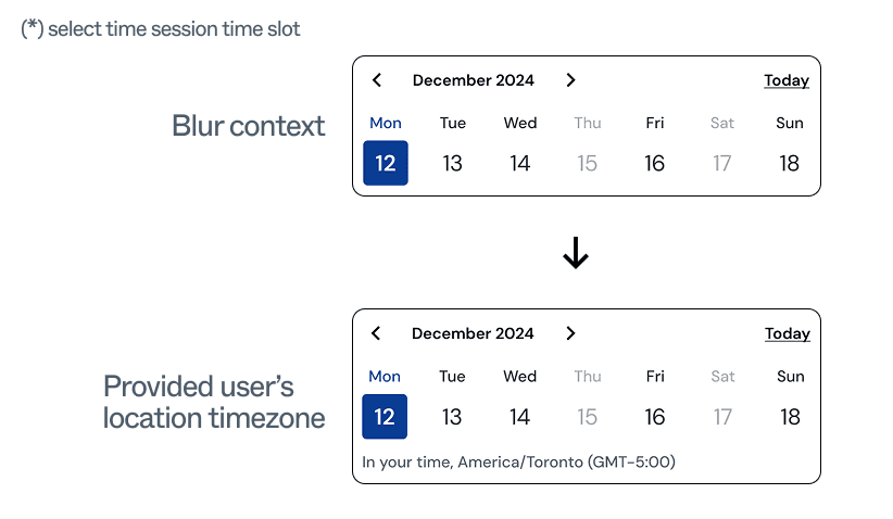
3.6 Select a time slot
Enhancing Clarity in Time Slot Selection with Timezone Context
Without timezone clarification, users might engage in mental calculations, convert times manually, or even book a session at an inconvenient or incorrect time
Payment
Design


Image
3.7 Payment screens
Ensuring Trust and Transparency in Transactions
My primary objectives in designing this screen were to ensure complete transparency regarding costs, provide secure and flexible payment options, and most importantly, instill a high level of trust and confidence in the user before they commit to a transaction.
Chatbox
Design

Image
3.8 Chat screens
Facilitating Real-time Learning and Support
The primary purpose of this chatbox is to provide a real-time channel for students to ask questions, share problems, and receive immediate assistance from their tutors
Profile & Community
Design


Image
3.9 Community & Profile screens
Fostering Engagement and Growth
The "Profile" screen establishes user identity and offers a path to becoming a tutor, while the "Community" screen fosters peer-to-peer learning and discussion. My objective in designing these sections was to cultivate a sense of belonging, encourage continuous learning, and provide avenues for users to both consume and contribute knowledge.
User interface
Image
3.3 Listing screens
Enabling Efficient Discovery
My primary objective for this screen is to empower users to efficiently browse a diverse pool of tutors and quickly identify candidates that meet their specific needs. I aim to reduce friction in the tutor discovery process by presenting key information upfront, offering robust filtering options, and building immediate trust through clear indicators. Ultimately, I want users to feel confident and informed when selecting a tutor
Image
3.4 Tutor detail & info screens
Deepening User Engagement & Trust
This screen builds directly upon the tutor listing, serving as the dedicated space for users to dive deeper into a tutor's profile before making a booking decision. My objective here is to provide comprehensive information, reinforce trust, and facilitate an informed choice, transforming a casual browse into a confident selection
Image
3.5 Book a session CTA
Optimizing the Call to Action
The initial design, featuring a straightforward "Buy Lesson" button, presented a significant user friction point. The refined design, moving towards a "Buy Trial Lesson" and offering session duration choices, directly addresses user apprehension and enhances conversion by providing flexibility and reducing commitment.
Image
3.6 Select a time slot
Enhancing Clarity in Time Slot Selection with Timezone Context
Without timezone clarification, users might engage in mental calculations, convert times manually, or even book a session at an inconvenient or incorrect time
Fostering Engagement and Growth
The "Profile" screen establishes user identity and offers a path to becoming a tutor, while the "Community" screen fosters peer-to-peer learning and discussion. My objective in designing these sections was to cultivate a sense of belonging, encourage continuous learning, and provide avenues for users to both consume and contribute knowledge.
Image
3.9 Community & Profile screens
Image
3.8 Chat screens
Facilitating Real-time Learning and Support
The primary purpose of this chatbox is to provide a real-time channel for students to ask questions, share problems, and receive immediate assistance from their tutors
Ensuring Trust and Transparency in Transactions
My primary objectives in designing this screen were to ensure complete transparency regarding costs, provide secure and flexible payment options, and most importantly, instill a high level of trust and confidence in the user before they commit to a transaction.
Image
3.7 Payment screens
Testing & Validation
Image
3.3 Listing screens
I didn't stop at a polished prototype. I shipped Tutornomic as a TestFlight pilot to my own campus and ran moderated usability sessions, so the next round of design decisions came from real student behavior — where they hesitated, dropped off, or lost trust — not my assumptions.
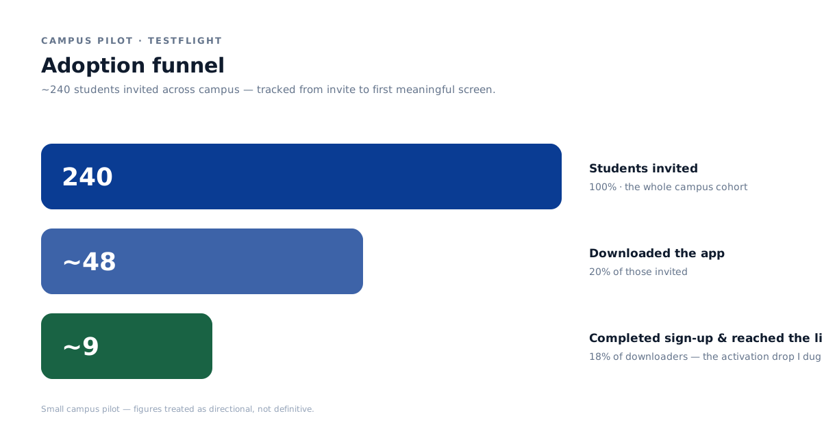
Campus pilot (TestFlight, ~240 students)
Reach: ~240 students invited; ~20% installed the pilot build (~48 users).
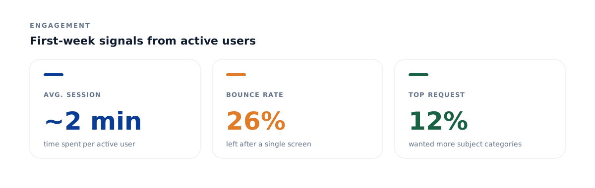
Engagement: average session ~2 minutes, ~26% bounce.
Biggest funnel leak: the largest drop-off happened right before booking a session.
Most-requested improvement: ~12% of users asked for more subject categories — a coverage gap I expected to close as students from more majors joined, rather than a design flaw.

Image
3.3 Listing screens
Moderated usability testing (5 sessions) Alongside the pilot I ran five moderated sessions, each covering three core tasks — find & book a tutor, become a tutor, and join a session room — recording time-on-task, behaviors, verbatim reactions, and a pass/fail rating. Four findings drove the redesign:
Booking confidence — not search — was the bottleneck. Users found tutors fine, but comparing them took time and they wanted deeper profiles (teaching style, methods) before committing. Paired with the pilot's pre-booking drop-off, this told me the hesitation was about commitment and trust, not discovery.
Payment lacked a trust signal. A participant finished a booking unsure whether the payment had actually gone through — a confidence gap at the highest-stakes moment.
Room-code entry was inconsistent. One user joined in 12 seconds; another couldn't locate the room-code field, re-entered it several times, and grew anxious about being late — a discoverability problem on a time-critical action.
"Become a tutor" was smooth but under-guided. The form was fast, but users wanted examples of strong tutor profiles to model.
What I changed (evidence → decision)
Lowered the commitment barrier at booking. Because the biggest drop-off was right before booking and users hesitated to commit, I replaced the single "Buy Lesson" action with a "Buy Trial Lesson" entry point plus session-length options — turning a high-commitment decision into a low-risk first step.
Closed the payment trust gap. I made costs explicit before commit and added a clear post-payment confirmation state, so users never have to wonder whether it worked.
Made the room-code field obvious. Elevated the input and added inline guidance so a time-pressured student joins in seconds.
Added profile guidance to help new tutors build trustworthy profiles and give students the depth they'd asked for.
Results & next steps
This was a small campus pilot, so I treat the numbers as directional, not definitive. The clearest signal — the pre-booking drop-off — directly shaped the trial-session model. Next I'd re-test the revised booking and payment flows against the same tasks and track booking-completion rate, pre-booking drop-off, and payment-confirmation comprehension to confirm the changes move the needle.