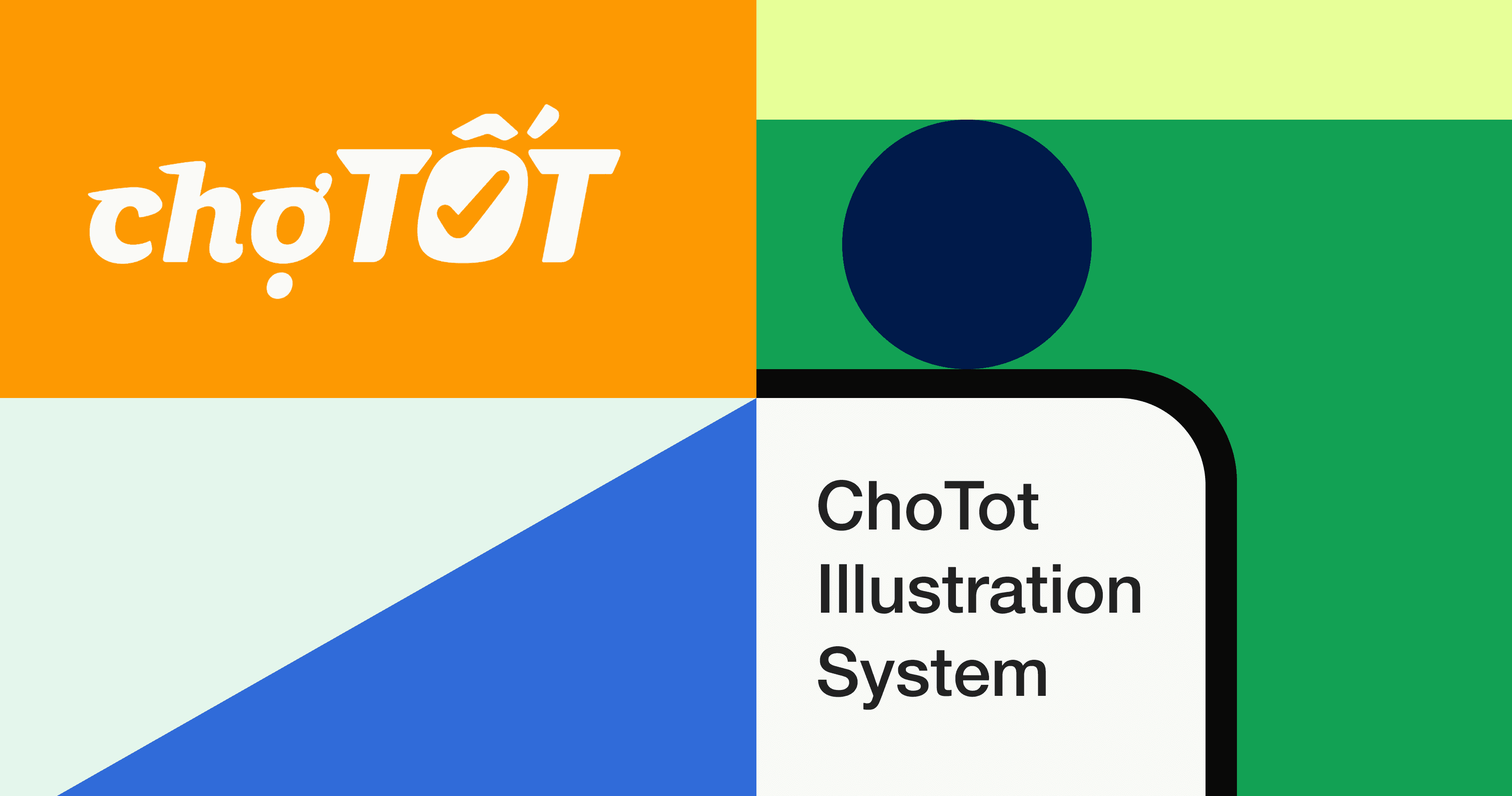
ChoTot Illustration System
ChoTot's Illustration System is designed to be user-friendly, easy to understand, and playful. The system includes a collection of visual elements and graphics that are tailored to the needs of the app's users, with a focus on creating a fun and engaging experience. The playful nature of the illustrations is intended to appeal to users of all ages, while the user-friendly design ensures that the system is easy to navigate and understand.
ChoTot's Illustration System is designed to be user-friendly, easy to understand, and playful. The system includes a collection of visual elements and graphics that are tailored to the needs of the app's users, with a focus on creating a fun and engaging experience. The playful nature of the illustrations is intended to appeal to users of all ages, while the user-friendly design ensures that the system is easy to navigate and understand.
Client
Client
Cho Tot Inc
Cho Tot Inc
Role
Role
Product Designer
Product Designer
Introduction
Introduction

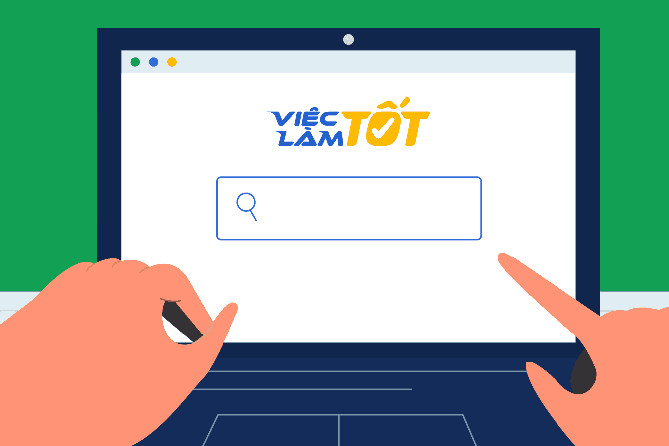
Image
2.1 Illustration banner
The role of illustrations
Illustration is a key element of the brand system.
Our illustrations range from detailed hero images down to in-product spot images with a consistent narrative of practicality, optimism, and friendliness used throughout. This is accomplished through shape, color, softness, and curves to achieve an inviting, engaging experience.
Illustrations can:
make complex ideas more accessible
represent our brand - personality, voice, and platform - in an efficient and clear way
scale up or down depending on the context
affect tone and speak directly to users depending on the job to be done and the user's emotional state
help to tell stories and thoughtfully convey ideas - they should not be used as decoration or without consideration
Principles
Principles

Image
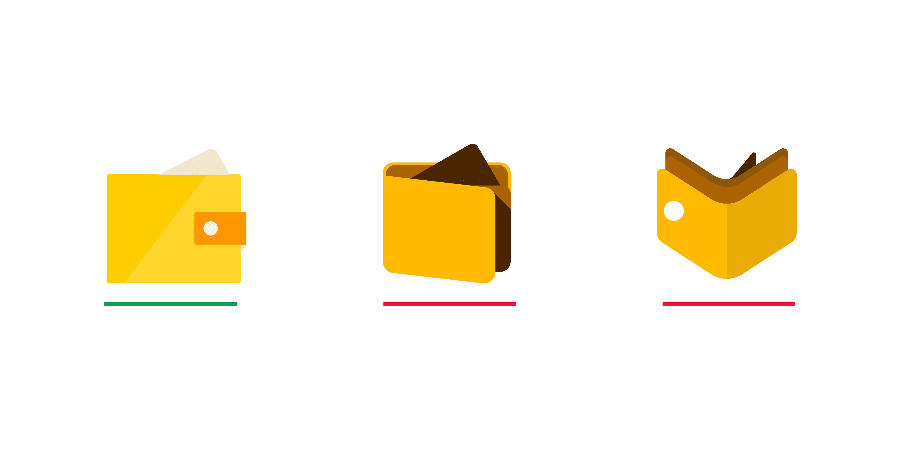
2.2 Examples of shapes
Shape
To maintain consistency in the ChoTot Product illustration system, use organic shapes for representations of people and simple geometric shapes with rounded corners for objects. This approach ensures realistic proportions and creates clear, approachable images.
Image
2.3 Examples of perspective
Perspective
Objects must be in a flat, two-dimensional perspective, ensuring equal importance across the illustration. Use drop shadows for subtle depth when needed, and add another side of an object if it’s not easily recognizable from one view.

Image
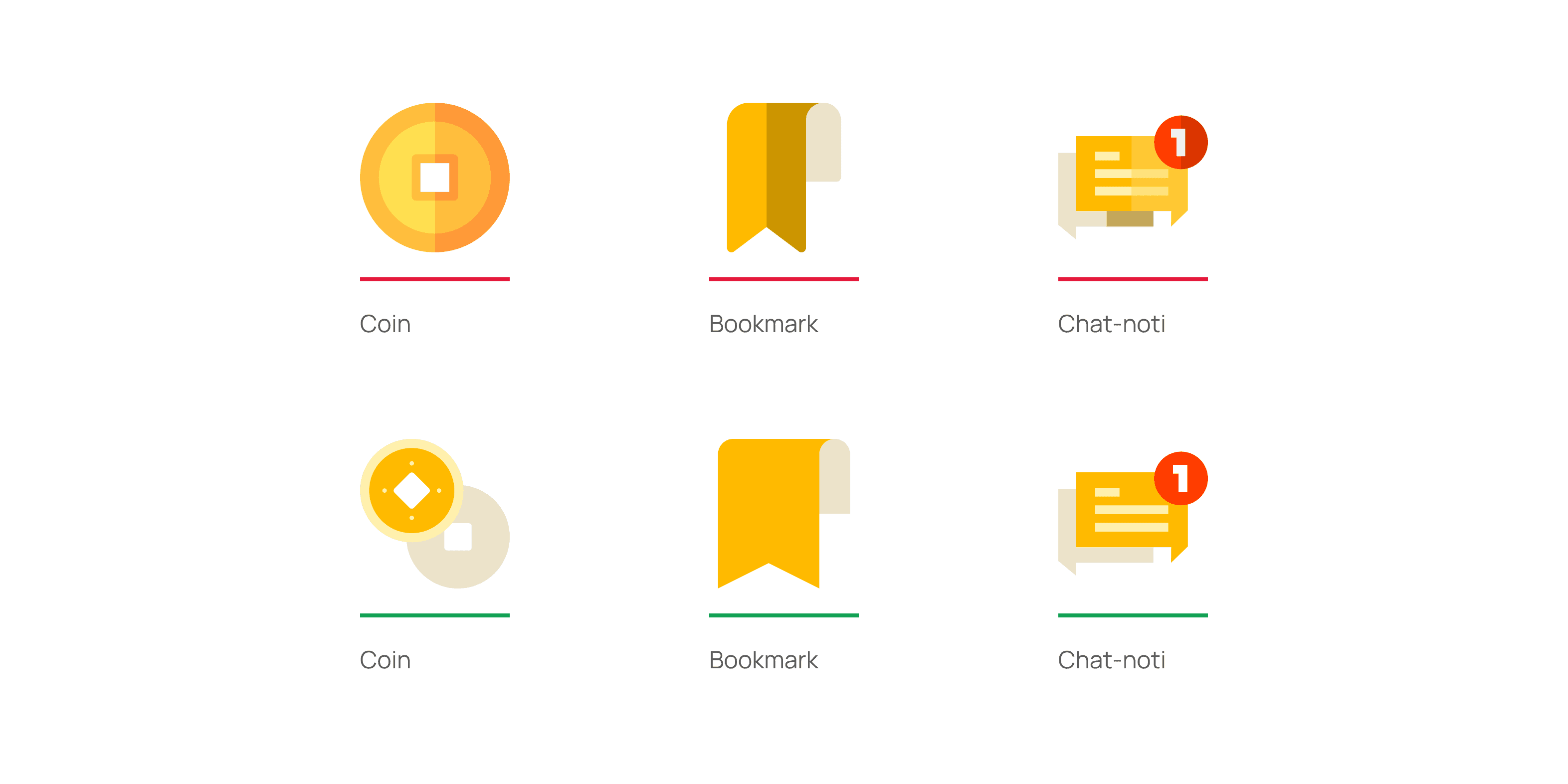
2.4 Examples of stroke
Stroke
To create harmony between illustrations in ChoTot.
Illustrations should be display in shape of bold fill image to convey clearly message.
(*) Can use lines to enrich illustration but not to be focused on
Image
2.5 Examples. of shadowing
Shadowing
Use drop shadows (e.g., white shape on a white background) to convey depth and meaning. Ensure shadows align with the same line of sight for a natural separation of layers; avoid forced lighting effects.
Showcase - Hero illustration


Spots illustration
Spots illustration


01
Introduction
Image
2.1 Illustration banner
The role of illustrations
Illustration is a key element of the brand system. Our illustrations range from detailed hero images down to in-product spot images with a consistent narrative of practicality, optimism, and friendliness used throughout. This is accomplished through shape, color, softness, and curves to achieve an inviting, engaging experience. Illustrations can: make complex ideas more accessible represent our brand - personality, voice, and platform - in an efficient and clear way scale up or down depending on the context affect tone and speak directly to users depending on the job to be done and the user's emotional state help to tell stories and thoughtfully convey ideas - they should not be used as decoration or without consideration
02
Principles
Image
2.2 Examples of shapes
Shape
To maintain consistency in the ChoTot Product illustration system, use organic shapes for representations of people and simple geometric shapes with rounded corners for objects. This approach ensures realistic proportions and creates clear, approachable images.
Image
2.3 Examples of perspective
Perspective
Objects must be in a flat, two-dimensional perspective, ensuring equal importance across the illustration. Use drop shadows for subtle depth when needed, and add another side of an object if it’s not easily recognizable from one view.
Image
2.4 Examples of stroke
Stroke
To create harmony between illustrations in ChoTot. Illustrations should be displayed in the shape of a bold fill image to convey a clear message.
(*) Can use lines to enrich the illustration but not to be focused on
Image
2.5 Examples. of shadowing
Shadowing
Use drop shadows (e.g., white shape on a white background) to convey depth and meaning. Ensure shadows align with the same line of sight for a natural separation of layers; avoid forced lighting effects.